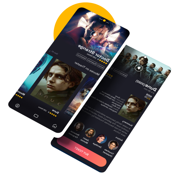
Cinema App
As a big fan of Marvel and DC movies Usually, I prefer to watch those masterpieces on the big screens in the theaters.
I think it is easy, fast, and better to buy the ticket online but not from the website, and through an application.
So here it is my design for cinema mobile application.
Style Guide
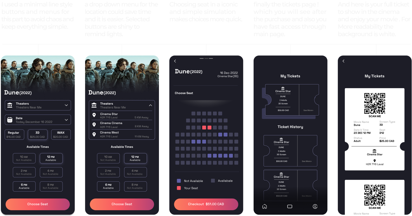
The first thing that comes to mind about the cinema is the dark space and the big screen. So I used a dark theme for the whole application. Colorful posters, videos, and photos on the dark background felt more focused. Also tried to use bright and sharp colors only for the keys and important contents.
Font
Space Grotesk is the font that I used for this application in all three types: Bold, medium and regular.
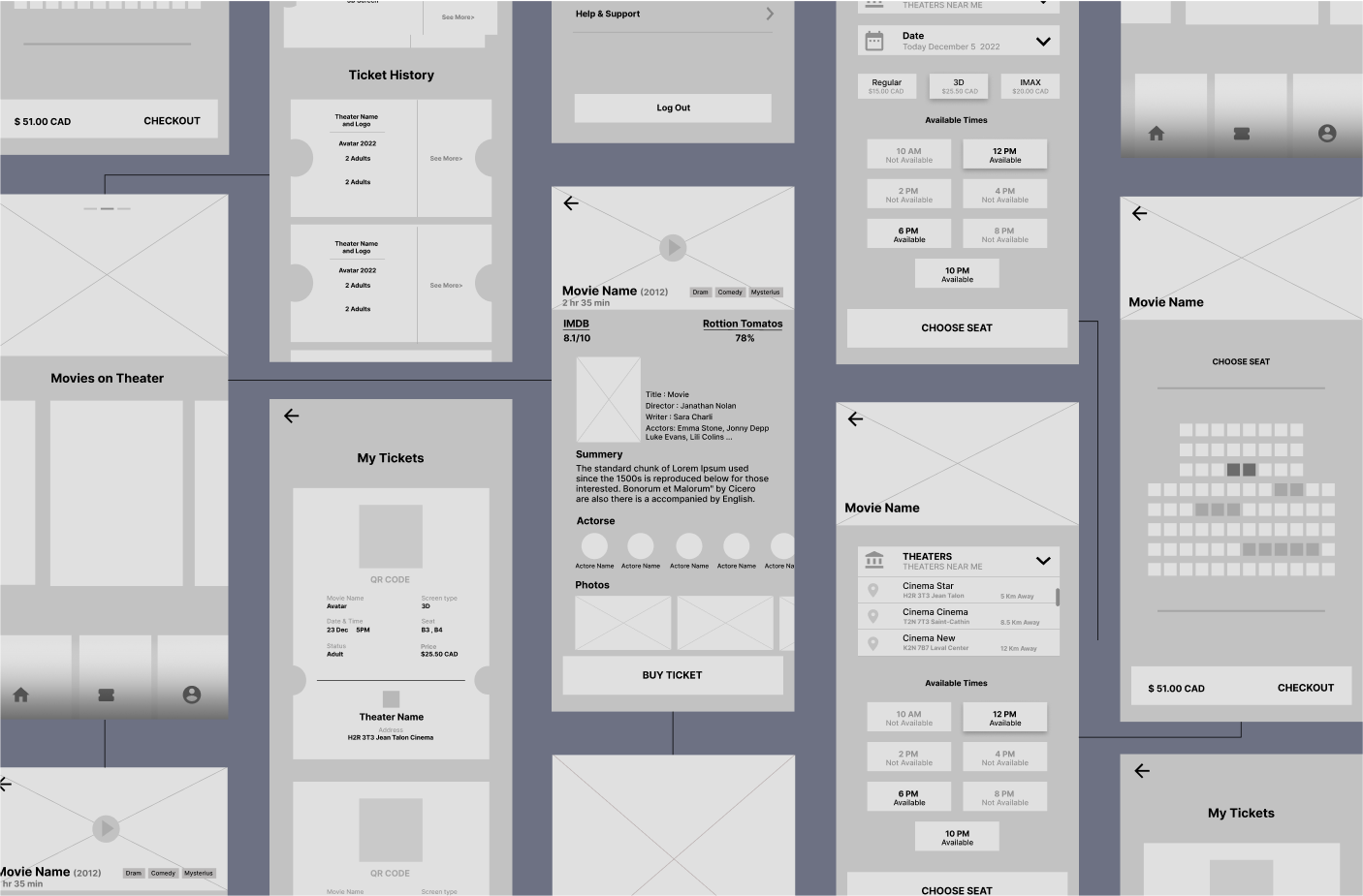
Wireframe
UI & Visual Design
🏠 Main Page
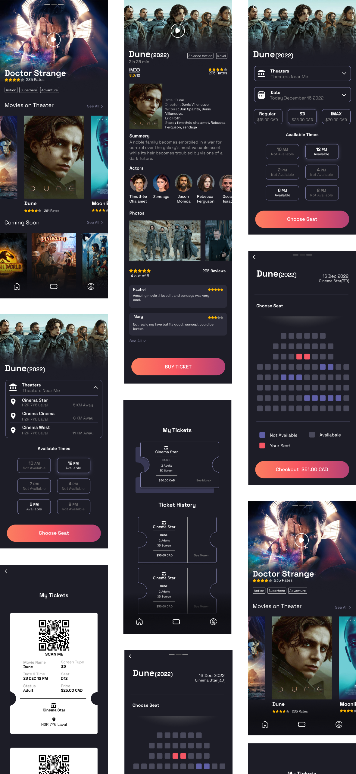
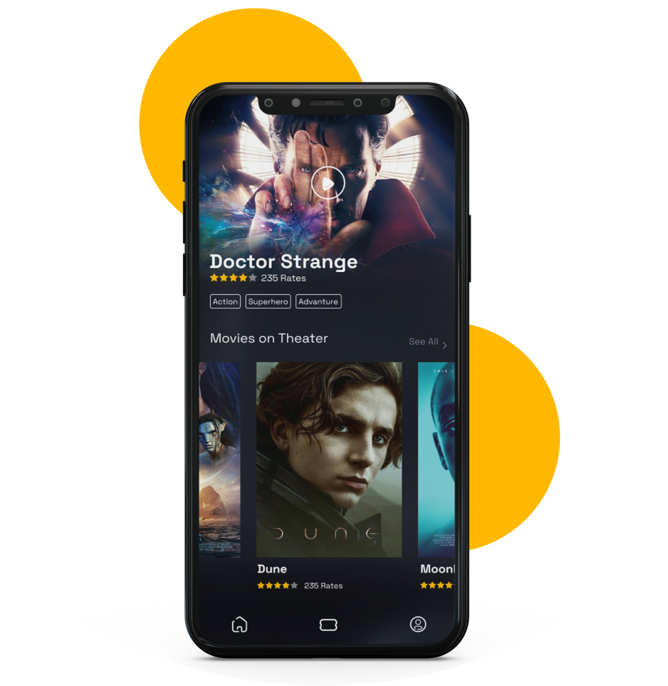
The main page is full of movie posters, which are the most important elements of a cinema and movie ticket app.
Since the images are full of details and the style is dark, I decided that the minimal icons would be a good choice to make balance.
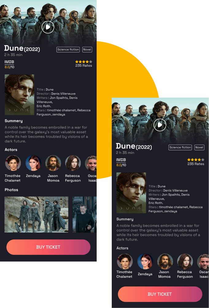
📽️ Movie Page
Your journey starts here. The movie page should contain important and key information about the movie. This information makes the audience decide whether to choose this movie or not. Finally, there is a button to start the adventure!
I thought that using a good gradient can attract enough attention. Also, the large size of this button attracts even more attention.
Your Journey To The Ticket
